As the updated NHS England figures are processed, the picture is now a grim one.

When adding the HNS England data we clearly see a trend. On all days were we have stable NHS England data, it’s always higher than the value published on gov.uk, except for one. The saddest day was on April 4th, but given the current preliminary figures that record will be broken again, and by a significant margin.

Other statistics are now made available. One such cases is the fatality rate, was has consistently been downplayed, but with the updated figures some trends are revealed:
- actual fatality rate is significantly higher than reported, by more than 10%
- fatality rate in England more than doubles those of Scotland, Wales or NI
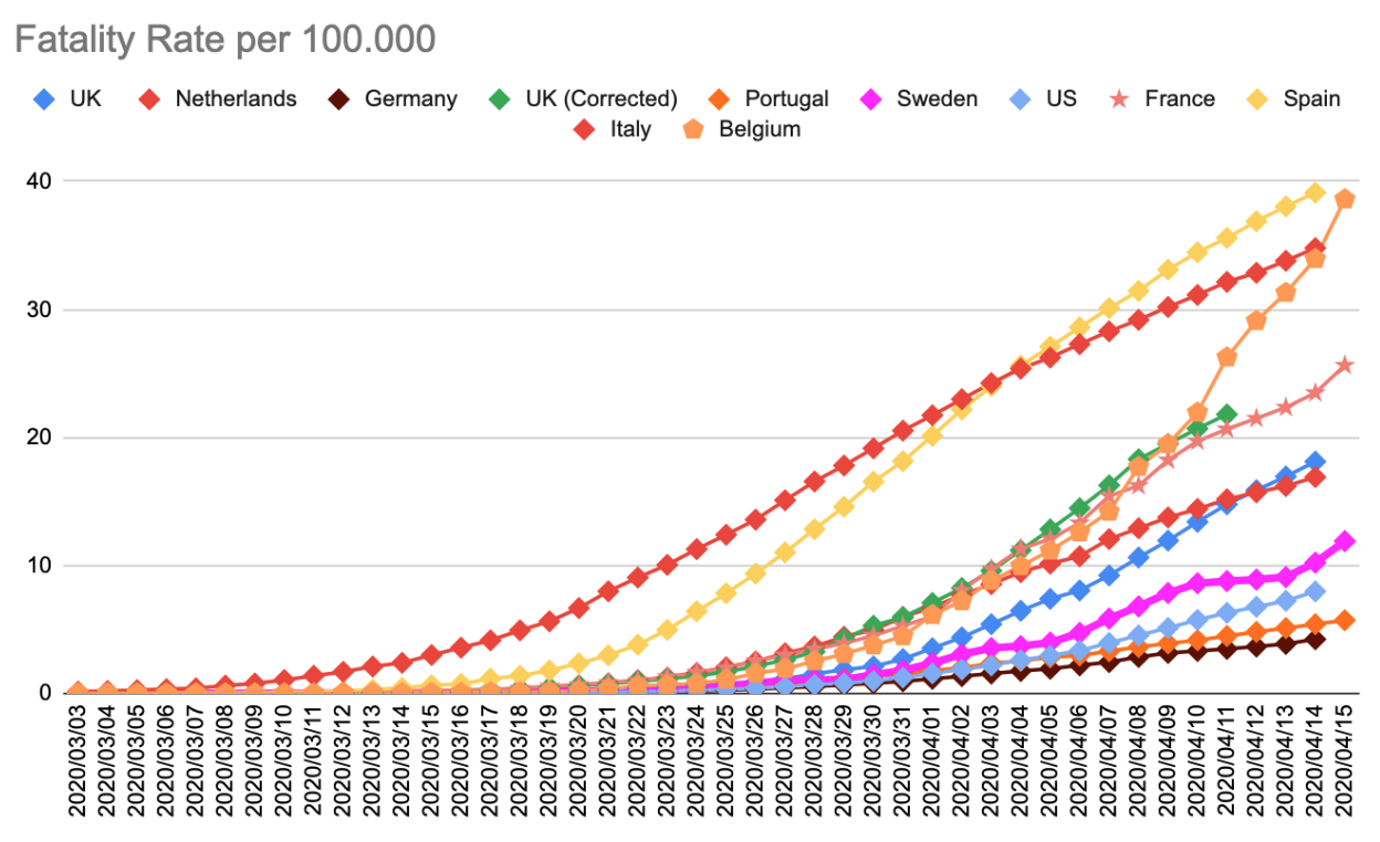
Using the updated figures paints a different picture of where the UK stands as compared with other countries. On April 11th, it was thought to be below countries such as the Netherlands, or France. In reality the UK was already far above the level of the Netherlands, and still above those of France.
Lets see how things evolve over the next week.