It seems weird that the entire world is relying on a single private website to know where it stands. Even weirder that on some countries there isn’t even one official portal announcing to the world how many people were affected by the Covid-19 pandemic, never mind publishing accurate and on time data on indicators such as number people in ICU (other than the PM), people having recovered from the disease or even fatalities.
The UK every single day looks eagerly at the daily figures published on Gov.uk by Public Health England (PHE) and the Department of Health and Social Care. Then, let’s just ignore for a minute how few indicators are being published ( cumulative infections by community, number of tests, number of tests subjects and fatalities). Let’s then focusing on the single most important figure of the pandemic (not because people are nothing more than figures, but it is the only way you size how big the disaster is, and why people should be locked at home): fatalities.
The thing with fatalities is the method used to collect that information: you ask hospitals how many people were reported in the last 24hours to have died in hospitals in those same 24 hours, related to Covid-19, as collected by the different health authorities: NHS England and Improvement, Health Protection Scotland, Public Health Wales and the Public Health Agency from Northern Ireland. And this should work, at least if we ignore people might die outside hospitals by whatever reason including those in nursing homes, although France did ignore such cases in the inicial stages just to realize the size of the hole later, but Spain and Italy were counting those since the very early stages, or at least they though they were.
This method should work, as it does on most other European countries. However there’s always the small print problem, as described by the weird wording “many people were reported in the last 24hours to have died in hospitals in those same 24 hours, related to Covid-19, as collected by the different health authorities”, which is then further complemented by “The amount of time between occurrence of death and reporting in these figures may vary slightly and in some cases could be a few days, so figures at 5pm may not include all deaths for that day.”
The problem here is that people not having been reported before 5PM the next day are not included, not will be included on the days after, at least on the Gov.uk web site.
Those are the cases which take a few days to be sorted out, and by a few I mean 4 or 5, and they eventually get published on NHS England web site. However, and this is the really strange part, the updated figures are never fed back into the total number of fatalities calculated by the Gov.uk web site.
Finally, all fatalities, including those occurring outside hospital, will eventually be tallied by ONS, but with a few weeks delay, so these will not be available for some time.
Now, the corrections made by NHS England shouldn’t by a matter of concern, unless it amounts to more than 2500 deaths than previously announced, this trend is just growing:
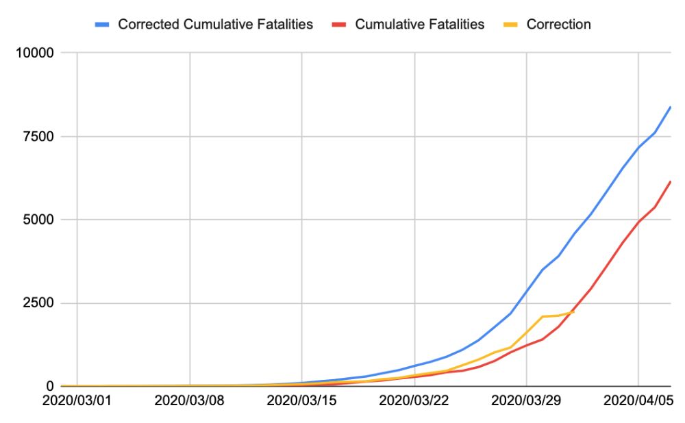
And what a difference it makes.
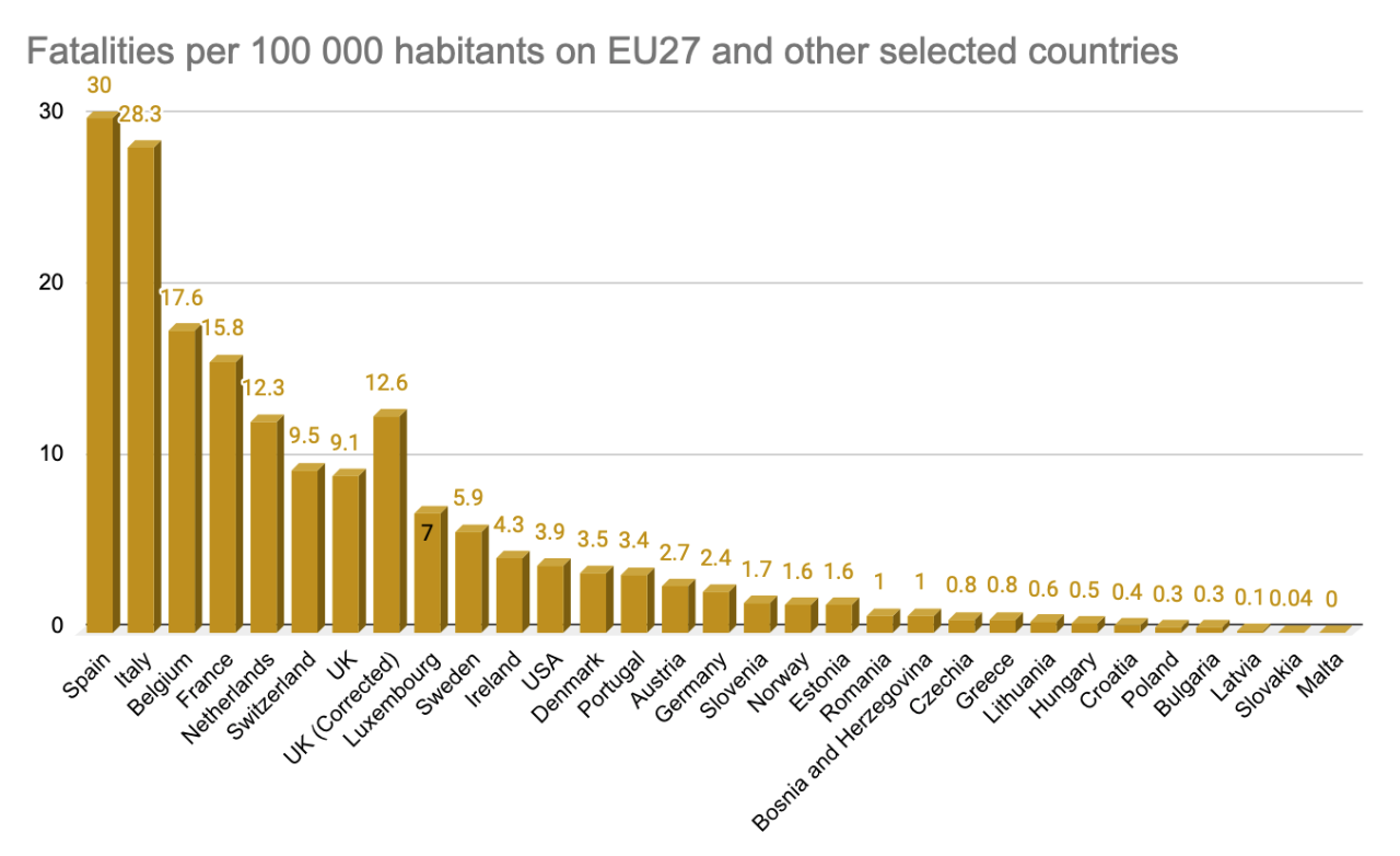
It means that the UK jumps from 9.1 fatalities per each 100 000 habitants to 12.6, and jumps from the 7th highest fatality ratio in Europe, to the 5th, ahead of the Netherlands.
It also affects the trend.

So, instead of being significantely below the group of countries with most fatalities (but still nowhere near Italy and spain), the UK is now closely aligned with the Netherlands, and just shy of France.
As usual, raw data can be found here.